Visualising in meaningful ways: five examples to discuss the issue
First online, autumn 2019. Last updated, March 2020
Kristrún Gunnarsdóttir, Jie Jang, Maria Xenitidou, Nigel Gilbert and Klaus Moessner
(University of Surrey)
The examples of data processing and visualisation presented here are all but one based on sensor-generated data. The last on the list is a mock-up intended to inspire curiosity to push the question of what could be purposeful and useful visualisations for analytic purposes in social research. The data samples are explained and discussed, first to foreground possibilities in using together sensor data with other data sources to establish what is going on, then to address some of the questions these possibilities raise: That includes the uncertainties surrounding data correlations, the singularness of each unit of observation, and the use of visualisations as analytic tools:
-
-
- The first example illustrates the use of environmental data captures to virtually visit and intimately witness people’s dwellings and daily lives. It describes an ordering of data plots (and data normalisation) to support human perception of space and recognisable activities therein.
- The second example is taken from a published article to illustrate and discuss the task-specific focus of machine learning and activity recognition of what goes on. It brings that discussion around to the question of getting it right as simultaneously attested and contestable.
- The third example combines energy use and physical activity data to assess what is going on inside an intimate dwelling while following the inhabitant as if through a window to witness the intensity of their physical activities elsewhere.
- The fourth example is a visualisation using environmental data combined with capture of location data, considering how such data on multiple inhabitants can support the perception of presence, absence and activity participation.
- The fifth example illustrates an idea of what it could look like to visualise contextually (meaningfully) using multiple data sources and aiming toward a lot more visual complexity.
-
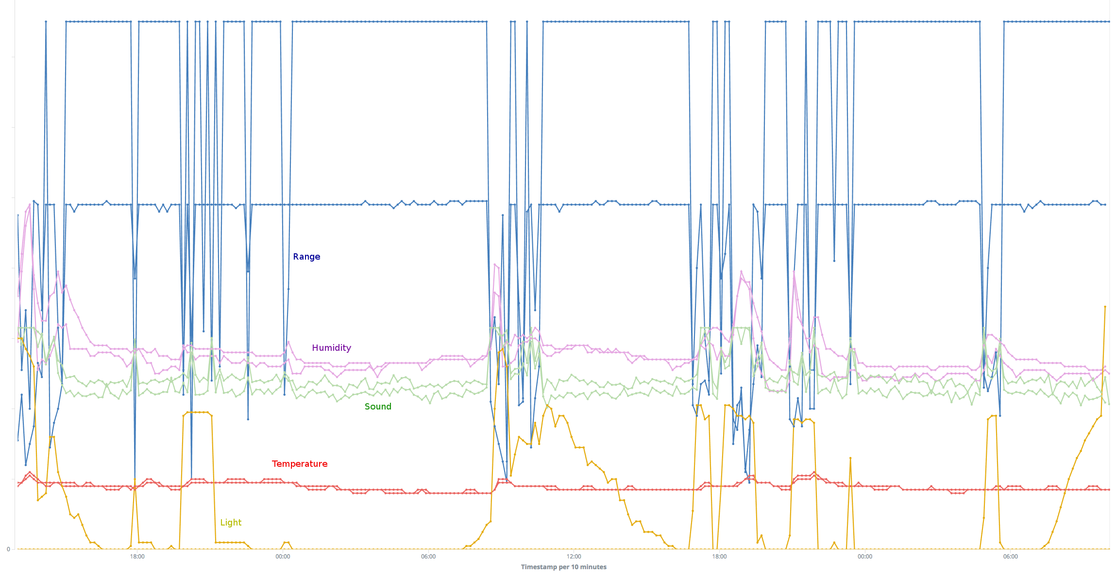
1. Environmental data streams from a home kitchen
This visualisation of 45-hour data capture in a home kitchen is an example of witnessing by environmental sensing. The snapshot, starting 1pm on a Saturday and ending 10am on a Monday, shows combined data streams from two sensor boxes fitted in different parts of this kitchen which explains why there are two plots of each colour showing different measures but the sensor types are colour coded:
-
-
-
-
-
-
-
-
-
-
-
-
-
-
- Yellow = light intensity ( μW / cm2 )
- Red = temperature ( ℃ )
- Green = sound levels ( dB SPL )
- Purple = relative humidity ( % )
- Blue = proximity of bodies ( 0 – 150 cm )
-
-
-
-
-
-
-
-
-
-
-
-
-
o
It is not important to see exactly from which box the data are streaming in this example (see example 4 below for comparison) … expand
Rather, combined data from two boxes in the same room, strengthen the visual representation of trends that are indicative of ebb and flow of activities going on, however, rendered entirely in environmental states and changes with the data streams timestamped every 10 minutes on the x-axis.
Looking at the y-axis however, the plotting together of very different data formats into a single image (temp, humidity, light, etc.) has been adapted to strengthen the perception of recognisable ordinary goings-on: preparing meals, using heat, fetching items and, in distance by measure, going to bed (sleep) and getting up.
The y-axis (from 0 to 150) is representing 4 data formats in absolute terms each, however, of unrelated types, and the data values for light intensity have been normalised to fit proportionally (visually):
-
-
- Temperatures in RED are recorded variably between ca 19 and 24 degrees Celsius
- Sound levels in GREEN are recorded variably between ca 45 and 70 decibels
- Relative humidity in PURPLE is recorded variably from ca 50 to 80 percent with a single spike hitting close to 100%
- Range in BLUE is measured in centimetres and differentiates the sensor boxes in terms of their positioning relative to fixtures and human traffic in range. One shows variation in distance to a solid body between ca. 40 cm (closest proximity) and 150 cm (unobstructed), while the other shows variation in distance to a solid body between ca 20 and 100 cm.
- Light intensity in YELLOW has been normalised to fit within a numerical range between 0 and 60 for proportional representation which here includes the data stream from one box only.
- Temperatures in RED are recorded variably between ca 19 and 24 degrees Celsius
-
This approach to data representation is unorthodox but, once the question is out of the way of what has been done with the data, the image can be examined as a snapshot of a functioning kitchen. What IS there (computationally) can be suspended while the viewers dwell upon the question of what they think they are looking at that renders before them a visual access of sorts to this singular kitchen. It is an exercise in the imagination, and in that of epistemic experimentation:
...does the placement of the data points and relative positioning of ‘absolute’ and ‘normalised’ plots of different data types fold together a storyline (from left to right) of busier and quieter times, different times of day and night, more or less intense meal preparations, ‘cosy’ mornings, late night munchies, having a cuppa, going to bed, and so on?
The great potential of visualisations lies in the affordance of virtual visitation to the site(s) in question and a virtual witnessing through representation of the activities that go on (see Shapin & Schaffer, 1985 1 on virtual witnessing in empirical science; Lynch & Woolgar, 1990 2 on representation in science). The kitchen is in many ways an ideal-type to experiment with as long as it is a well-defined enclosure into which inhabitants enter to do something particular, then leave. Given the distinct practical utility of kitchens, viewers are likely to recognise elements of kitchen life in the time-stamped data flow, relative to what they already know and/or assume about home kitchens.
It is much less clear what can be known that is squarely about this singular kitchen until the field records and other collections of data are consulted. We (the researchers) recorded what the inhabitants (a couple) said and what we observed, having first-hand access to the household and its inhabitants. They explained how the kitchen is used almost exclusively by the husband who does all the meal preparations. We have statements on record about routines and division of labour, and we have our own observations on the premises in notes that take into account the overall layout of the dwelling and indoor traffic in relation to everyday practices in the home as they were explained to us by this couple.
We observe that the kitchen is very small ( 3-4 m3 ), however, appreciated. The husband prepares 2-3 meals per day, and they typically have cooked breakfast together in the warmth that cooking generates in the kitchen on cold mornings. A gas hob, oven and a kettle are the only devices producing heat to prepare a hot meal, and those three along with the use of hot water are the main sources of humidity and heat in the air. We observe the small observatory at the end of the kitchen behind glass doors, facing WSW, and we have noted that it is late November with sunrise close to 8am and sunset close to 4:30pm. We know that the sensor boxes capture a relatively short window of dawn, day and dusk, and the fluctuations in natural light if otherwise undisturbed by artificial lighting or obstructions that cast shadows.
As far as OUR virtual visitation goes then, we enter around 1 pm on a Saturday and it definitely looks like preparations of a hot meal. We see downward (blue) spikes that are a capture of the husband moving around in close proximity. There is a big spike in relative humidity, indicating that the room is very steamy, increased sound levels and a change in temperature by ca 5℃ which is noticeable change for persons.
Over the first two hours of this visit, we are witnessing meal preparations with an interim spell of less intensity but after that the kitchen is abandoned until ca 6pm when a light is turned on and someone briefly enters and exits, generating some noise. The next period of intense activity starts around 8pm when a light is turned on again and the husband is busying himself in the kitchen for about an hour and a half until the light goes out. This time we do not witness much change in temperature or humidity, only fluctuating sound levels so we can safely assume there was no hot evening meal prepared on this day. Later in the evening we see someone enter and exit twice without turning on a kitchen light, first ca 10:30pm and again around midnight when there is also rise in humidity.
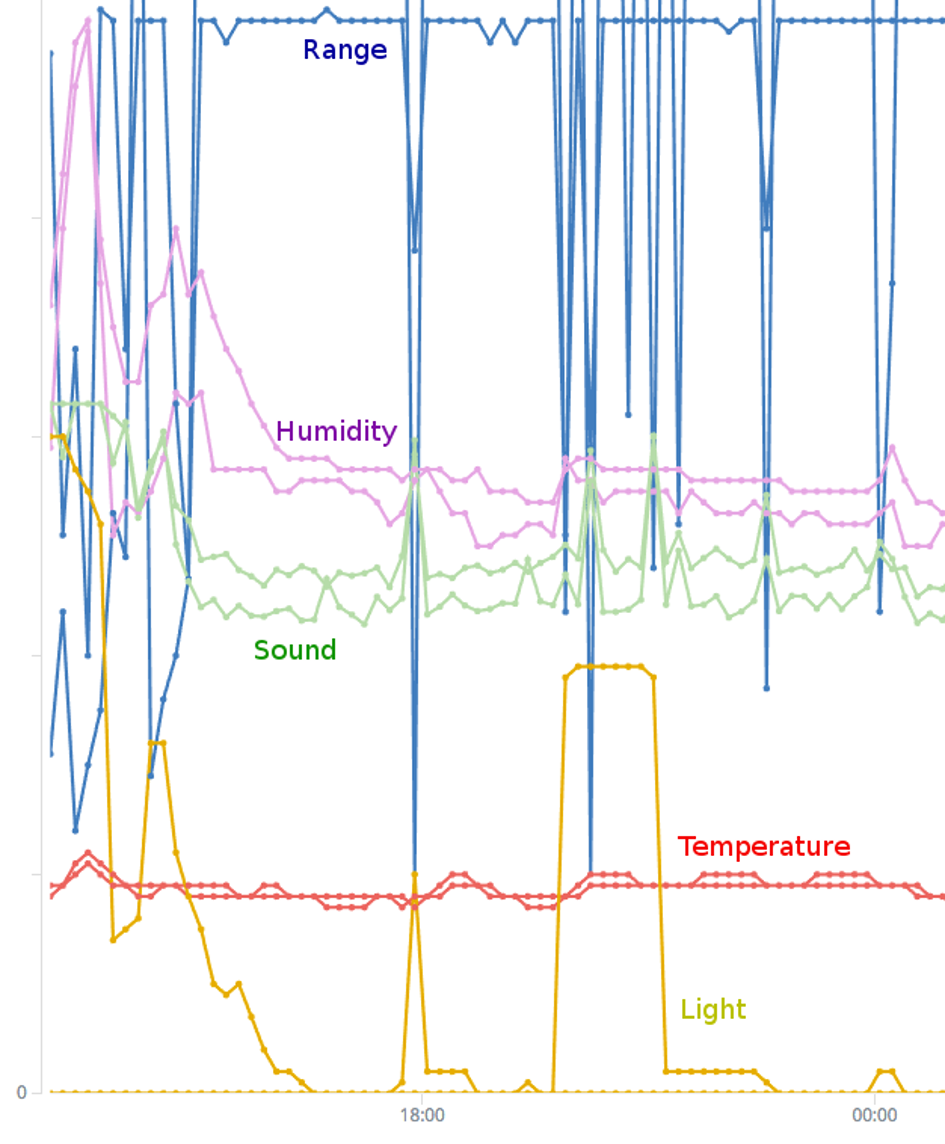
There are a few details of curiosity to us (the researchers) in this opening data capture, especially how the light source relates to the activity and what to read into more subtle changes in humidity and sound levels. For example, the light is very bright when we enter (bright lights turned on) until it drops significantly (lights turned off) for 20 or so minutes before it is a lot brighter again (light turned on) and then drops as the dusk is also settling in. One could argue that, with the days so short, the witnessing of kitchen activities is illuminated by the capture of artificial light: bright lights, weaker lights and distant lights, depending on the need for lighting. That need is telling in many ways of the type of activity most likely going on at different levels of light intensity, say, fetching tea or snacks, doing dishes, loading or emptying the washing machine, attending to lengthy meal preparations and so on.
The visualisation, as we understand it, is also indirect witnessing of the hallway outside where we already know there is an entry into a bathroom and further into a bedroom, hence, affording the indirect witnessing of activities out there with indications of some back-and-forth traffic into the kitchen, from where distant/weaker sources of light are detected. On the first night this happens right after 6pm, again briefly on around 7:30, then after 9:30 for a while and finally for a short while around midnight.
Although these ‘fringe’ data do not render clear evidence of what goes on beyond the confines of the kitchen, they are indicators of life at home away from but also in connection with activities on the main stage. If visualisation is an analytic tool in its own right, researchers might be puzzled by such outliers in relation to more obvious evidence of activity and/or they can attach to them meaning and occasion to revisit the inhabitants for clarifications. For example, there are uncertainties about some of the changes in humidity and sound that correlate with presence but variably with change in lighting. The 6pm and midnight activities on the first evening could very well include (one or the other or both) the use of a kettle. Kettles can be noisy and are likely to increase humidity, although, depending on the proximity to the relevant sensor. The visualisation begs the question but can not resolve it while it could be resolved computationally if electricity use is captured simultaneously (wattage of kettles is 2000+) and the data streams pre-processed together for computational analyses. Fluctuations in sound levels correlating to meal preparations might be trickier to ascertain computationally. Shall we simply take for granted that this is the clamour of pots and pans, dishes and cutlery? Perhaps no need to attach particular importance to such readings, just assume that meal preparations, cleaning and other activities in kitchens can be noisy?
Again, we (the researchers) already know about this household that the couple do not own a single electrical food processor. What exactly is noisy apart from such equipment and kettles, washing machines on wind and busy bodies? In the absence of a full audio recording or, say, sound analyses that distinguish voices from machinery from music from barking dogs and other distinct textures of sound, we can only ask directly and perhaps find the answer completely unsurprising and banal once we hear it: I play music when I am working in the kitchen. More specifically, we are told by the husband that he typically places his mobile close to one of the sensor boxes.
This question about noise levels was asked to fill an analytic gap in the visualisation of sensor-generated data, however, leaving the researchers wondering if the answer is an interesting observation about people’s kitchen practices? Does any of what we learn from these data streams engender novel questions, i.e., on the topic of households as sites for empirical social science and humanities research in an ever-changing world? Methodological understanding of the value of first-hand access for observational purposes is very well established, but how is unique value or added value of using sensor-generated data assessed, made meaningful and established within these disciplinary fields?
In any case, it is clear from this experiment that the researchers attach meaning to the finer nuances in the data capture, the main reason being that they can not escape the awareness and relevancy constraints of prior knowledge obtained by other means than collecting and processing sensor-generated data. We (the researchers) can not escape ordinary (qualitative) questioning and reasoning as part of the conversation that goes on with participants during a field-trial that requires, by definition, first-hand access. Working these constraints is part and parcel of the analytic labour, of rendering visual representations and learning to see in them what is going on as findings. In building our insights into household life at this particular site, it even became a source of learning that all the sensor boxes we installed suddenly stopped detecting activity for a few days, starting right around the time this snapshot ends. We learned that ‘normal’ morning activity in the kitchen on the last day, clearly involving a hot breakfast, is happening unusually early (5-6am) as part of last preparations for travel and time away from home.
One can argue that the kernel of this experiment is establishing meaningful physical and virtual access to the field site, the activities and the research participants, i.e., to engender multiple ways of seeing and knowing, questioning and reasoning that testify to continuity in academic research interests and approach within the social sciences and humanities. Not only are we pushing here questions on method, i.e., how sensors and sensor-generated data can fit in with an existing methodological toolbox. We are pushing questions about experimentation and discovery, that new instruments afford new ways of seeing and doing as with, say, the telescope and the microscope. Arguably, the case so far is that viable visualisations for analytic purposes require, not only, multiple sources of qualitative and quantitative data, but hinge on a two-way revolving door between representation as work-in-progress and learning to see what one is witnessing in and through that work (e.g. Suchman 2007). 3
To sum up, this data sample quickly reveals just how powerful environmental data are for rendering very intimate access to someone’s kitchen. It represents a lot to know about the ebb and flow of activity and in considerable detail, albeit, supported with other sources of data. A much larger sample would eventually render stable computer recognition of the most conspicuous types of activities, applying algorithmic processing and analyses (see example 2). The consistently recognised activities however, may not be terribly interesting or important data on kitchens and household life, hence, not relevant for the purpose of learning anything new. Such results could be valuable however, in an entirely different manner, i.e., for being an impressive exercise in getting right (algorithmically) what we know more or less already with practical implications for the development of assistive (and safeguarding) IoT products and services.
2. Getting it right? Computational access to a ‘world’ encoded in sensor-generated data.
The data samples discussed here are from a published article in which the authors suggest the use of digital sensors as an “alternative means of observing activities in the home” (Jiang et al, 2017). 4
 “For example, temperature, humidity and light sensors can report on the physical environment where activities occur, while energy monitors can report information on the electrical devices that are used to assist the activities. One may then be able to infer from the sensor data which activities are taking place.” (2017: from the abstract).
The data streams in this experiment are confined to four consecutive days in three single-occupancy households for which self-reported diaries of time use are available for input … expand
This is a mixed-methods approach with which to illustrate, among other things:
-
-
- how correlations are identified between self-reported activities in time-use diaries and features found in the data streams that evidence most strongly those selfsame activities;
- unsupervised machine learning of the sensor-generated data with feature extraction of data clusters and data change-points;
- an agreement evaluation between the automated sensor-supported activity recognition and human reporting of concurrent time use.
-
The uniqueness of this experiement lies in the approach to a mixing of methods and in the formal framework for evaluating the effectiveness of unsupervised machine learning (see also HomeSense blog, Dec 2017). In other words, the article (click here), published in the Journal of Sensor and Actuator Networks, is not simply an account of the science and engineering involved in particular choices of processing and analysing sensor-generated data for activity recognition. It is a contribution of a framework for evaluating the results. Discussing the article here however, is aimed at broader questions of value (e.g. purpose and usefulness) which includes asking if ‘getting it right’ algorithmically (or not) is delivering meaningful data/information, i.e., data of interest to researchers of household life and societal practices more generally.
Consulting the entries into the time-use diaries at 10-minute interval, the authors chose seven activity types to experient with: sleeping, preparing a meal, preparing a hot drink (tea or coffee), eating (breakfast, lunch or dinner), watching TV, listening to radio and doing laundry. The assumption is that these ‘activities’ are detectable in the data captures of environmental and energy-use sensors, which then are processed to extract the data features that most strongly agree with those activities.
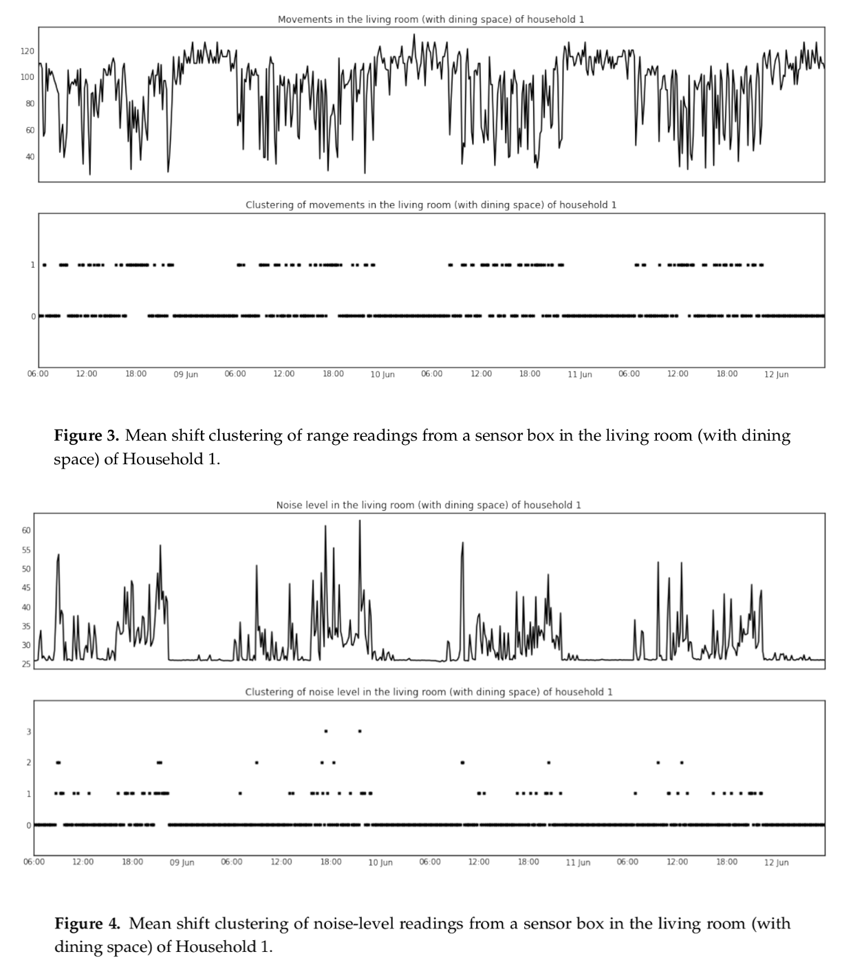
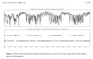
Figures 3 and 4 in the article (p.12) are data plots that exemplify what the clustering of motion intensity in range and the clustering of noise levels look like, respectively, over four days inside a living/dining area in one of the households. One can argue that, in spite of the abstraction, these plots give viewers a feeling for something alive on this stage, however, it is impossible to know the details of what is going on and the plots are clearly data processing visualisations only, not analytic instruments.
The article makes a point of elaborating the variability of which environmental and energy use data most strongly agree with the activity types in question, and it exhibits a number of data plots, each of which exemplifies a data processing visualisation (human and machine rerporting compared). They may or may not be legible to those who work in other fields of research but these elaborations are an important eyeopener in a different manner entirely.
For example, preparing a hot drink in the mornings in a ground floor kitchen in one of the households finds agreement in the detection of a coffeemaker in use, however, a strong (secondary) agreement is found in the rise in humidity in a utility room and a bedroon one floor up. The reason for that, according to the corresponding diary of time use, is the occupant’s habit of shaving in the upstairs bathroom next to those rooms while the coffee-maker does its job downstairs. Similarly, doing laundry finds agreement in detecting washing machines in use, however, this agreement is poor in one of the households while in another household a strong (secondary) agreement is found in the detection of other kitchen appliances in use at the same time. The reason for this in the former case, leads to speculation, i.e., that a reporting of ‘doing laundry‘ in the diary is actually refering to sorting the laundry, hanging it out, folding it, etc. In the latter case, the diary of time use also reports cooking and making coffee within the same timeframe of doing laundry.
A curiosity here turns on the question of what consitutes an activity or, say, the household practices of getting up in the mornings and doing laundry, which begs the question again of novelty concerning the kinds of lessons that can be learnt about household life from sensor-generated data. It may very well be of significant research interest to be able to automatically assert that a person shaves, makes and takes coffee in the mornings and discovering the assistive contribution of a machine in completing these morning tasks. However, if the preparation of the coffee has been delegated almost entirely to a machine, then a preparing a hot drink activity only applies to the person within the time-restricted confines of setting that coffeemaker up to do the job. In other words, first they got the coffeemaker going, then they shaved and then they took coffee, i.e., three distinct sequential activities, none of which is accurately assessed as preparing a hot drink.
Something similar can be said about the doing laundry activity when it actually is a washing machine in use and only applies to the person within the time-restricted confines of loading that machine, choosing a programme and turning it on. Thereafter, the machine-in-operation is a backdrop to any number of activities a person might engage in and report while it does its job, or until they can offload it.

It should not come as a surprise if people report that they are doing laundry while delegating it, considering ordinary speak that routinely conflates the contributions of humans and machines in accomplishing tasks. Lack of agreement should not come as a surprise either, considering that if a person reports being engaged in some laundry-related activity, it is just as likely a manual tasks of sorting, loading and offloading a machine, hanging up, folding, etc. The curiosity turns on the uncertainty as to the purpose and usefulness of achieving identification of one or other aspect of what is indeed going on.
Along these lines, the validity of meaningful activity recognition is cast in doubt or could even be refuted in other areas, for instance, in case of uncertainty about the strength of correlation between a TV or radio turned on or music playing and someone actually watching and listening or sharing as an activity. Either scenario might be of great interest to researchers of household practice, say, if TVs, radios and stereos are sporadically turned on and off or if they are routinely left on overnight or in the absence of persons in proximity. However, we will come up short in validating the correlations or the lack thereof without collecting other types of data.
o
o
o
o
o
o
Some examples of agreement discussed in the article seem a lot more intuitive and potentially useful. For instance, being asleep in a bedroom may find strong agreement in gaps in detection of motion in thoroughfares of that same household, and a correlation between preparing a meal and then eating it (according to diaries of time use) could mean that the automated recognition of the former will help substantiate the recognition of the latter.
Overall however, the results and analysis section of the article (p.19-22) breaks open the discussion of what can and can not be known about household practices based on automated recogntion of the activities in question, i.e., if the sensor-supported observations can capture or assist in capturing activities as one would normally understand and report them, or capture practices as they unfold in ordinary experience. The science and engineering involved is not the most pressing challenge here. Research into activity recognition is already a thriving field of investigating methods of achieving, improving and evaluating results but, it is often under the umbrellas of social research, social computing or computational social science that, for instance, the future smart home is approached as an engineering interest in automated activity and event recognition. It is approached in support of IoT innovation, however, for ‘social’ purposes such as for smart buildings, effective energy use, security and infrastructural management, home life and assisted living. One example of the last on this list would be the detection of accidental falls of elderly persons to actuate response, using accelerometers and cardiotachometers (Wang et al, 2014).5 The presumed ’social research’ involved in that speaks to a common perception that elderly persons falling in their homes is a social issue.
In that sense, various activity-specific studies directly contribute to or have implications for IoT innovation and development which arguably runs counter to a long history of the social sciences and humanities being practised on the sidelines of industrial progress and marketing. That said, the vast majority of engineering experimentation in this area so far, joins forces with behaviour research (psychology and medicine) rather than the social sciences or humanities (Jiang, et al 2017: section 2 on Related Work). Examples include the use of accelerometers to study people’s sleep patterns or studying dietary behaviours using inertial sensors, sensing collars and ear microphones. The design of actuators to then respond to the relevant states and changes centres on behaviour intervention, drawing on behaviour psychology and a common perception – again – that (un)healthy sleep and (un)healthy dietary behaviours are social issues.
The curiosity here is what appears to be a casual mix of perception—of what constitutes a social issue, social research, the scholarly technical concepts of activity, practice and behaviour and how they operate in scholarly traditions. It is not surprising that, in line with other research in this area, the HomeSense researchers paid hardly any attention to purpose and usefulness in their choice of activities, states and changes to investigate and present in this article, except for their positioning for evaluating the effectiveness of automated data processing and machine learning. In that sense, the experiment is a contribution to ongoing developments worth paying attention to, say, if the argument holds that good illustrations of how the science and engineering work will inspire confidence and impress upon social researchers to consider collaborations. By that we mean collaborations with computer engineers and computational approaches.
However, the snag is always whether or not machine-recognisable activities have enough import as observational data about social life and societal practice or if ‘getting it right’ (algorithmically) triggers too many ‘so-what?’ responses. Researchers might be interested in investigating family dynamics and child-rearing, practices surrounding meals and sleep, assisted living arrangements, mobile health solutions, homeworking, hobbies, hosting (partying) and energy use. The pre-existing normative methods continue to evolve. Interviews and observations are normative in capturing, among other things, the meanings participants attach to various aspects of their everyday lives and relations, mobility, entertainment and sense of belonging. Quantitative methods such as questionnaires and surveys are normative in capturing information in formalised ways for computational processing, for instance, on societal constitutions, social attitudes and the like. Diaries of time-use are harmonised so that they can be more instructive over time, for example, about life changes and social evolution. In other words, these methods are normative and they evolve to address prominent matters of concern, and it follows that questions of purpose and usefulness with respect to matters of concern are central to normative and evolving use of sensors and associated technologies in observations of all manner of societal practice.
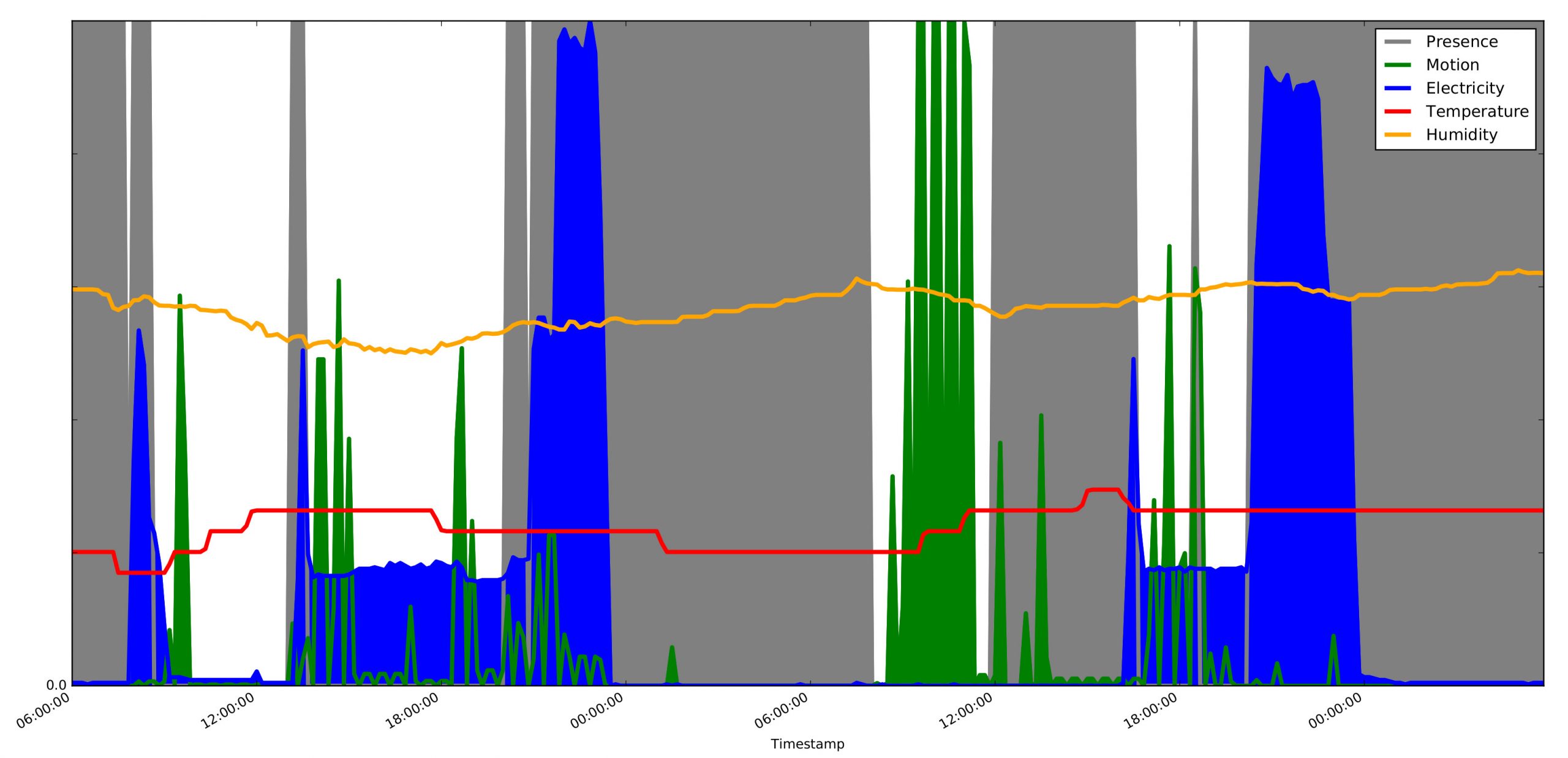
3. Physical activity across space
This 48-hour visualisation renders environmental data captured inside an en-suite bedroom and private dwelling within a shared household, together with physical activity data produced by the sole inhabitant and captured with an activity sensor (wristband).
-
-
-
-
-
-
-
-
-
-
-
-
-
-
- Grey = presence of inhabitant
- Green = physical motion ( unit / min )
- Blue = electricity use ( watts )
- Yellow = humidity ( % )
- Red = temperature ( ℃ )
-
-
-
-
-
-
-
-
-
-
-
-
-
Similarly to example 1 above, the y-axis (0 – 125) is used to display together data of different formats. Temperature and humidity are in absolute terms each: ℃ in Red and relative % in Yellow, the measures indicating a more or less stable interior. Electricity use (in Blue) and the intensity of physical motion (or lack thereof) in Green are normalised data streams. Three data streams are sourced inside the room exclusively while the forth is a separate data stream sourced off the inhabitant’s body as they go about their everyday life … expand
Crucially, this example visualises presence and absence in the sense that the viewer can observe the environmental states and changes, either together with physical motion inside the room, or by ‘looking outside’ as if through a window to witness the inhabitant’s physical motion elsewhere with the interior environment in overlay. Presence is distinguished with a grey background to signify enclosure / interior as opposed to the white background signifying windows looking out.
Fluctuations in electricity use and the intensity of physical motion are the data streams that stage the activities and events in this visualisation. Activity and event recognition however, is substantiated by consulting the researchers’ records of what was said in interviews and conversation, observed on site, from questionnaires and time-use diary data (see also examples 1 and 4).
For example, we (the researchers) already know that this visualisation bears witness to the presence of a media hub in the room, consisting of a laptop hooked up to a monitor, and a flat screen TV hanging off a wall, all plugged together onto a multi-plug extension to which an electricity monitor has been fitted. We know that the four approximate levels of electricity use represent: 1. standby; 2. the laptop idling; 3. the laptop and an external monitor in use; and, 4. the TV turned on. We also know about routine walks to and from the workplace on weekdays: leaving in the mornings, coming home for lunch breaks and returning home in the late afternoons. Then there are the occasional afternoons running errands in town and we know about active pursuit of (mainly outdoor) physical training and participation in sporting events which can be associated with periodic stretching and strengthening sessions inside the room. Finally, we have a record in a diary of time-use, of when the inhabitant is in another part of the household using kitchen facilities, when they are leaving the house and returning, which also correlates with increase and decrease in the intensity of physical motion.
Knowing all this, the virtual visitation starts 6am on a Friday and ends 6am on a Sunday. If viewers follow the activity capture and electricity use in reference to presence and absence, they can witness the inhabitant moving out of bed ca 7:30am on the first day, turning on equipment, briefly exiting the room and returning (fetchin breakfast), then turning off the equipment and moving vigorously for a short while outside the window (walking to work), then appearing more or less at rest (at work), i.e., remaining outside until ca 1pm.
There is obviously a brief gap in the activity data stream, starting at noon on this day but viewers can observe the inhabitant returning to the room around 1pm and turning on equipment, then leaving shortly and engaging in physical motion again outside the window and for a longer stretch than in the morning (running errands). After that the viewer can see some motion intermittently until it increases markedly soon after 6pm—still outside the window (walking home, using kitchen facilities). The inhabitant is not seen again inside the room until after 8pm where, notably, equipment has been left turned on for hours since earlier in the day.
The evening and overnight is spent inside the room, electricity use increases in a couple of steps and the inhabitant is regularly active inside the room (stretching / strengthening) until the clock approaches midnight. After that the use of electricity drops off and only a short burst of motion is seen during the night, around 1:30am.
The morning after (Saturday), the inhabitant leaves around 8am followed by very intense physical motion captured shortly thereafter outside the window and lasting until ca 11:30am (running). The inhabitant is back in the room at noon and stays put until around 5pm, sporadically quite active in the first couple of hours (stretching / strengthening). Equipment is turned on toward the end of the stay and then the inhabitant leaves without turning it off. The viewer can see the physical activity outside the window, a momentary return to the room roughly 6:30pm, and again returning after 8pm (with the evening meal). The use of electricity increases sharply and we see minor motion for the rest of the evening, but electricity use decreases again in a couple of steps as it drops off around midnight. The last 6 hours (overnight) are uneventful.
Knowledge obtained by other means than collecting sensor-generated data is instrumental in learning to see in this visualisation the indicators of the habits and routines the inhabitant already explained to us (the researchers) and could for the most part be captured by the sensors. Perhaps the most obvious next step should be to process computationally a much larger segment of these data streams to assert with definition and clarity these routines and habits: of coming and going at certain intervals, of routinised week days and weekends, of going to bed and getting up, bouts of intense physical motion, interest-specific equipment use, regular mealtimes, and more. The activities that go on at this particular site touch upon societal expectations of habitual lifestyles with fixed routines and hobbies, regular sleep patterns, and particular modes and orders of doing things. We might be able to say with certainty that we are witnessing a weekday habit of turning on a laptop in the mornings, to browse, check emails and news, look up programmes to download, etc., a variation of this routine applying to the lunch breaks at home. We could assert the habit of settling down after the evening meal around 8pm and watching TV every night until the clock approaches midnight. We might also be able to clarify patterns of intense physical training elsewhere along with sessions of stretching and strengthening that take place inside the room. Furthermore, we could clarify a habit of leaving the laptop idling for hours on any day for no particular reason at all.
That said, a demonstration of computational capacity to get this right does not guarantee its relevance as a research method to investigate practices at home, say, practices surrounding sleep, mealtimes and use of media. It depends on what the investigation is for, what the research questions are. Automated processing and analyses of large quantities of sensor-generated data does not exactly replace interviews, questionnaires and on-site observations either, which is not to downplay the importance of such large-scale processing for the development and deployment of assistive and security services. As an experiment in virtual visitation and witnessing however, this visualisation here is first and foremost suggestive of multiple ways of seeing and reasoning. It establishes access by normalising and rendering together environmental and physical activity data, i.e., to access the room and the elsewhere, the activities and the research participant coming and going. The repeatedly mentioned ‘window’ above is the virtual feature for viewing these data together across space. It represents access to an extended (non-specific) site of observation to support the witnessing of activities away from the room—an analytic instrumentation that might be of interest to those who study, for example, amateur athleticism in relation to lifestyle formation more generally.
To sum up, suggesting that particular goings-on can be seen, observed or witnessed ‘outside the window‘, refers to a deliberate attempt by the researchers at staging events across space and not just on a timeline. Combining data streams across space affords a 3-dimensional appearance of sorts, or the virtual means of being able to follow the person outdoors from within the room as if – precisely – through a window. This 3D effect also brings into perspective (visually) the variable intensity of physical motion that illustrates normal social-functional conditioning of being at home as opposed to outdoors. Depending on the analytic weight and purpose of knowing whether the inhabitant is present or absent, an entirely different approach is of course possible. Data patterns of more and less intense physical activity could be used alone to establish procedurally the presences and absences of the inhabitant. In this experiment however, we are drawing the attention to the trialling of virtual visitation as a vehicle of observational curiosity and a motivator to experiment with visual instruments and ways of seeing for analytic purposes.
4. Visual calibration for detecting persons at home and away

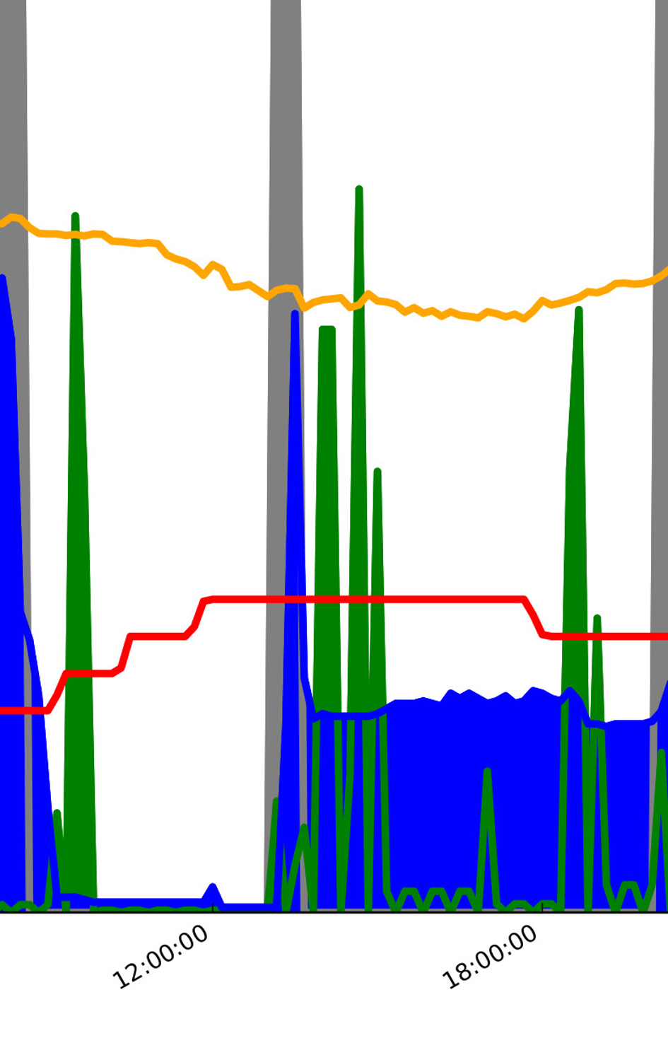
This visualisation has many of the same features as examples 1 and 3 above, which is evident primarily in the plotting together of very different data formats onto a single image and a rendering of data captured by two sensor boxes. What is unique here is the location of the sensor boxes in different rooms (kitchen and living room) with the data visualised to strengthen the human perception that the viewer is primarily visiting the kitchen while witnessing goings-on in the living room only indirectly. Another unique feature is the use of location sensing of the two occupants to explore the markers of presence, absence and activity participation.
Again, the y-axis (from 0 to 150) is representing multiple data formats in absolute terms each, however, of unrelated types:
-
-
- Temperatures in RED (kitchen) and ORANGE (living room)
- Sound levels in GREEN (kitchen) and PALE GREEN (living room)
- Relative humidity in CYAN (kitchen) and PALE CYAN (living room)
- Range in PURPLE (kitchen) and LIGHT PURPLE (living room) … expand
-
In addition to that, the location data for each of the occupants has been normalised to fit within a numerical range between ca 2 (absent) and 18 (up-close) for proportional representation:
5. She in PINK (kitchen) and PALE PINK (living room)
6. He in LIGHT BLUE (kitchen) and PALE BLUE (living room)
Dwelling first for a moment on the full-size snapshop of 96 hours, viewers can learn to see what constitutes, arguably, a virtual visitation and witnessing. Among the data features shared with examples 1 and 3 is how this visualisation affords the perception of three dimensions (see example 3) and of indirect witnessing of activities going on elsewhere on the premises (see example 1). Accordingly, the discussion here is focused on supporting the viewers’ perception of an overlay of two rooms, one foregrounded, one backgrounded, rendered together with location markers of proximity, motion and the absences of two occupants which also affords an extention of witnessing to other parts of this dwelling. The kitchen is shown by the strong colours signifying different data types and the living room, correspondingly, by pale versions of the same colours.
What we know already about this household from other data sources, is that the upstairs is being decorated (bedroom w/workstation and library), so the downstairs living room is a hang-out, a workspace and a bedroom. The only entrance in use is in the kitchen, through a small (back) yard with seating arrangement, plants and a fence. We also know that the couple have two dogs and a cat and everyone eats in the kitchen (or outside that door). The data stream which is not included here captures energy use, but we already know to assume that a TV is on most of the time, day and night, i.e., a portable hooked up to a large monitor to stream media if anyone is at home. Presence in the kitchen can also be associated with a radio/cd turned on.
For example, within the first hour of the first (Saturday) morning (6am – 7am), we see immediately that the occupants are both in the living room. The higher markers of their location (ca. 8-10) are in PALE PINK and PALE BLUE, hence, relating to the living room, not the kitchen next to it (PINK and LIGHT BLUE below). This is supported by their physical proximity in close range to the living room sensor box, shown in LIGHT PURPLE, while no one is detected in proximity to the sensor box in the kitchen (PURPLE). Sound levels are also a lot higher in the living room (PALE GREEN), compared to the kitchen (GREEN). And, according to their diaries of time-use, she is reading news, he is completing a survey, and TV / Netflix is on in the background.
Next we witness the switch in proximity detection. They move together into the kitchen and appear to move in different parts of the kitchen for roughly an hour. Considering the change in sound levels (GREEN), we can assume that the radio is on while breakfast is prepared and eaten, dishes are cleared and cleaned and the kitchen tidied, albeit, we see subtle indicators of back and forth traffic by him. Temperature is also up (RED) and so is relative humidity (CYAN), showing the same trend around morning meal preparations we witness in example 1. Consulting concurrent diaries of time use will support these assumptions, however, with the additional information that he reports taking the dogs outside (through the kitchen door) sometime between 7:10 and 7:30 am.
Moving forward, we next see a stark shift to absence and quiet (8:20 am) and it stays like that up until noon. They have clearly left the house, both of them.
Viewers can continue here, to trace the location markers on the timeline, i.e., of proximity, absence and motion along with changes in the environment, yielding impressively intimate observations. For example, between ca 1:30 and 4:30 pm on this first day, there is no presence and/or motion detected in range of the sensor box in the kitchen, nor the box in the living room. However, the location sensors put the pair somewhere in equal proximity to both rooms and the sensor boxes are capturing noise in somewhat equal measures. Ergo, they must be moving around upstairs so the visualisation is affording indirect witnessing of activity in a 3rd dimension of the household (above). Again, when consulting the diaries of time use, the occupants are organising the library upstairs with some back and forth motion between the library and the bedroom, then he reports being consistently at a workstation furthest away in the bedroom from 3:30 pm onward which finds a reasonable agreement in the sensor-generated data. Moving forward again, they are clearly both back downstairs pottering between the kitchen and the living room.
One can argue that observing the full 96 hours in one glance is revealing of shifts and clusters with considerable clarity, shaping the perception of ebb and flow of more and less intense motion, comings and goings and changing environmental factors. It supports a normative perception of a weekend followed by two weekdays, although, the impression is also that the two occupants are active to some degree during the night. At a closer look (zooming in), this is true. The longest stretch in which the household can be witnessed sleeping, is between midnight and ca. 4am on the second night. Otherwise, there is sporadic physical motion between the living room and kitchen, mostly by him, sound levels change in both rooms and sometimes the humidity rises in the kitchen. Assuming here typical nocturnal restlessness with a TV turned on in the background, which routinely calls for a beverage and snacks (perhaps), is actually supported in the diaries of time use, especially his.

As we argue in example 1, researchers will always analyse the sensor-generated data to some degree in reference to what they already know from other data sources, including, having direct access. Discussing this example however, is an exercise in imaging first what is going on in the data, then looking back at other sources, especially the diaries of time use. To further scrutinise the potential (and limitations) of the visualisation as analytic instrumentation, we have isolated the fourth day and enlarged ca 12 hours between 6am and 6pm.
5. Mock-up of how it could look: pushing the experiment
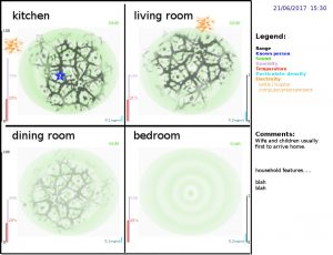
This last example is an animation video, illustrating a version of what it might look like to visualise contextually (meaningfully) by providing an overview simultaneously of four separate rooms in a single household over the course of 24 hours. This mp4 animation file holds 48 handmade frames, each representing an imaginary snap shot at half hour interval, the first frame timestamped at 04:00 am and the last at 03:30 am on the next day.
As a mock-up, it is exactly that and should not be understood to recommend particular ways of signifying and representing data types. For example, sound is signified structurally as waves emitted by invisible speakers and sound is GREEN. Motion detection is structured in similarity to the visual rendering of blood flow in vains and the flow is DARK GREY … expand
Electricity use is signified with ORANGE sparks on the fringes, and so on. In short, the way the ebb and flow is rendered along with metadata and comments on the right hand side panel are artistic choices, not practical actionable choices of how to render data. Those choices are meant to open up for dialogue, not define how to push the experiment.
Use PLAY / PAUSE to take a closer look at the details in each frame and developments from one frame to the next.
References
-
- Shapin, S. and Schaffer, S. (1985) Leviathan and the Air Pump. Princeton NJ: Princeton Univ. Press.
- Lynch, M.E. and Woolgar, S. (eds) (1990) Representation in Scientific Practice. MIT Press.
- Suchman, L.A. (2007). Human-Machine Reconfigurations: Plans and Situated Actions (2nd edition). Cambridge University Press.
- Jiang, J., Pozza, R., Gunnarsdóttir, K., Gilbert, N. and Moessner, K. (2017). Using Sensors to Study Home Activities. Journal of Sensors and Actuator Networks 6(4), 32. doi:10.3390/jsan6040032.
- Wang, J., Zhang, Z., Li, B., Lee, S. and Sherratt, R.S. (2014) An enhanced fall detection system for elderly person monitoring using consumer home networks. IEEE Trans. Consum. Electron. 60: 23-29.